10 Years on Victoria StreetSave up to $1,000 on your kitchen or bath. Print your coupon and bring it in.Get the coupon
✕
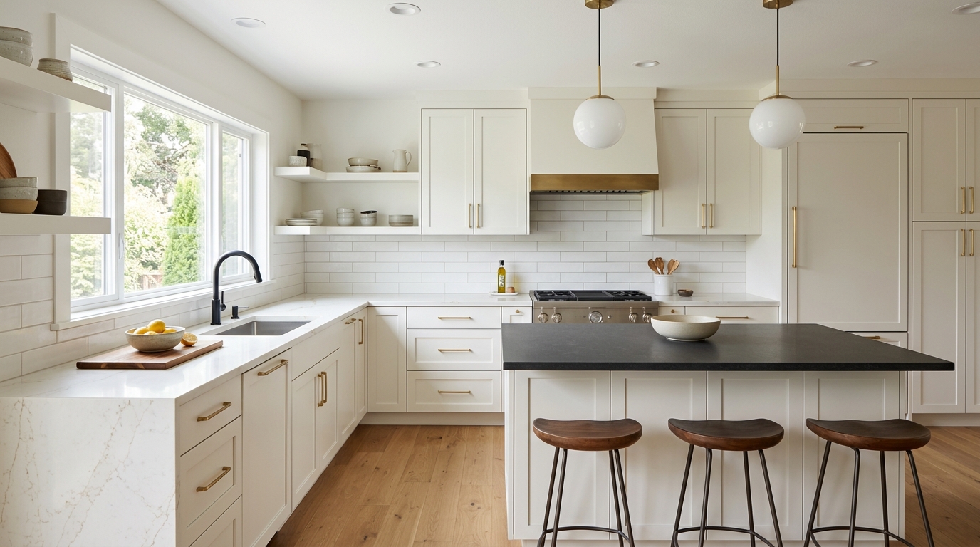
The most popular quartz countertop colours for 2026 are warm whites, Calacatta-style marble looks with gold or taupe veining, soft greige and creamy neutrals, concrete-look greys, and matte charcoal or black, most often used on an island. The biggest shift from a few years ago is temperature: the stark, cool white and flat grey that dominated the 2010s are giving way to creamier bases and warmer veining.
Below is what each colour family looks like, where it works best, and how to pair it with your cabinets. We've drawn on 2026 forecasts from major surface makers and fabricators, and on what actually holds up in Kitchener-Waterloo homes, where winter light is cool and grey for months at a time.
White is still the most-requested countertop colour, but the white has changed. Instead of bright, blue-leaning white, 2026 whites have a creamy or ivory base. Caesarstone's 2026 materials report points to earthy neutrals like "cream, bone, mushroom, and soft off-white," and nearly every major manufacturer is leading with warmer white backgrounds.
Marble-look quartz remains the headline look, but the veining is warmer. MSI's 2026 quartz forecast highlights warm whites with soft gold and beige veining, diagonal vein movement, and "cracked marble" patterns that read more like natural stone. Veins in taupe, sand, soft gold and even chocolate are replacing the crisp grey veining of the last decade.
One practical point: bold, directional veining makes seams more noticeable. On a long run or an L-shaped counter, ask where the seams will fall before you commit to a heavily veined pattern.
Greige, the grey-beige middle ground, is the colour of choice for people who want something softer than white but not as heavy as a dark counter. 2026 greys are warmer, with beige or brown undertones rather than the cool, blue-grey of a few years ago.
Concrete-look quartz gives you the industrial, matte look of poured concrete without concrete's porosity and staining. These surfaces usually come in soft greys with subtle mottling and are almost always paired with a matte or honed finish to keep the look raw rather than glossy.
Dark quartz is having a real moment, but mostly as an accent. The most common way it shows up in 2026 is a matte black or charcoal island paired with lighter perimeter counters. That two-tone approach gives contrast without making the whole kitchen dark.
Further out on the trend curve are earthy tones: warm beige, sand, and brown or rust-accented patterns. MSI's forecast includes rust, cinnamon and brown accents, and these tie into the broader "warm minimalism" direction in 2026 interiors. They're less common as a whole-kitchen choice, but they're worth considering if you're pairing with wood cabinets or want a kitchen that doesn't look like every other white kitchen on the street.
The same colour can look very different depending on the surface finish:
Whatever you choose, quartz is low maintenance but not indestructible: use trivets for hot pans and avoid harsh cleaners. Our quartz countertop care guide covers the details.
Don't forget the backsplash. A busy veined counter usually wants a quiet backsplash, and a plain counter gives you room for a patterned tile. Our kitchen backsplash ideas post has combinations that work.
The fastest way to know if a colour works is to see it with your cabinets, floor and backsplash together. At Kitchen & Bath World, we design every kitchen in 3D before anything is built, so you can compare countertop colours against your actual cabinet finish. Our quartz and porcelain countertops are templated and installed locally by our team, across Kitchener, Waterloo, Cambridge and Guelph.
Visit our showroom at 899 Victoria St N in Kitchener to see finishes in person, or request a free estimate.
Answers to your renovation questions
Warm white is the most popular quartz colour in 2026, usually with soft gold, taupe or beige veining in a Calacatta-style pattern. It keeps a kitchen bright without the cold, clinical feel of stark white, and it pairs with most cabinet colours. Greige and concrete looks follow, with matte black popular on islands. Match it to your cabinets using our 2026 cabinet colour trends.
No, white quartz isn't going out of style, but the shade is changing. Stark, blue-leaning white is giving way to warm and creamy whites with softer veining, which still read as white but feel less sterile. Warm whites remain one of the safest choices for resale. If you're worried about stains, read our quartz countertop care guide; quartz is non-porous and easy to clean.
With white cabinets, warm white quartz with soft veining gives a light, cohesive kitchen, while a Calacatta look with gold or taupe veining adds character. For contrast, pair white perimeter cabinets with a matte black or charcoal quartz island. Check the undertone: a creamy counter can look yellow beside a cool, bright-white cabinet. See how door profiles change the look on our cabinet door styles page.
Honed or matte quartz is slightly more work than polished because the low-sheen surface can show oily fingerprints and marks, especially in darker colours. It still needs only warm soapy water and a soft cloth for daily cleaning. Polished quartz hides oils better but shows scratches and smudges on dark colours. Many of the same looks come in porcelain too; compare the two in our porcelain vs quartz guide.
Choose the countertop first. There are thousands of paint colours but far fewer countertop options, so it's easier to match paint to quartz than the other way around. Look at countertop samples in your own kitchen at different times of day before deciding, since Kitchener-Waterloo winter light is cool and can shift warm whites. Pair the counter with a backsplash using our kitchen backsplash ideas.
Dark quartz works well as an accent, most often on an island paired with lighter perimeter counters, which gives contrast without darkening the whole room. It's less forgiving across a full kitchen because dark surfaces show dust, water spots and fingerprints more than mid-tones. A matte or leathered finish helps. Kitchen & Bath World designs every kitchen in 3D so you can see a dark island first. Explore our quartz and porcelain countertops.
Have more questions? We’re here to help.
Come see the cabinets and finishes in person at 899 Victoria St N, Kitchener — or fill out the form and our team will get back to you about your kitchen or bath project.